GBA Fintech Two-way Internship Project
Project at JobsLab (Hong Kong) as the UI/UX Lead

Overview
Cyberport Hong Kong and the Financial Services and Treasury Bureau (FSTB) launched the “GBA Fintech Two-way Internship Scheme for Post-secondary Students” and partnered with JobsLab to design and develop its online platform. As my first major project after joining JobsLab, I took on significant responsibility as the UI/UX Designer for the entire project in bringing this government-sponsored initiative to life.
As the UI/UX lead, I managed the entire design process within a tight three-month timeline and collaborated cross-functionally with the development team and the clients to prototype and implement feature sets.
The platform proved remarkable, facilitating over 5,000 applications from more than 2,000 students across the Greater Bay Area and Hong Kong.
Role
UI/UX Lead:
Feature Scoping, Research, User Flow Design, Information Architecture & Site Mapping, Visual Design & Interactive Prototyping
Timeline
Winter Term 2023:
Start from August 2023
Launched in November 2023
Summer Term 2024:
Launched in June 2024
Context
Cyberport and FSTB approached us to develop an online platform for their “GBA Fintech Two-way Internship Scheme for Post-secondary Students.” The program aimed to connect university students with fintech companies across both Hong Kong and the Greater Bay Area, fostering talent exchange in the region's growing fintech sector.
While the clients had a clear goal, they provided minimal specifications, giving me the freedom and challenge to shape the entire platform from scratch. As the UI/UX Lead for the entire project, my task was to envision, design, and deliver a comprehensive solution that would effectively bridge students and companies across borders.
As a startup, we approached this project with both immediate and long-term strategic thinking. My boss challenged me to create a design system that could not only serve this specific platform but also be adapted for future company projects and websites. This meant I needed to consider not just the current project requirements, but also design a flexible system that could scale and adapt for different use cases.
Research
User Research
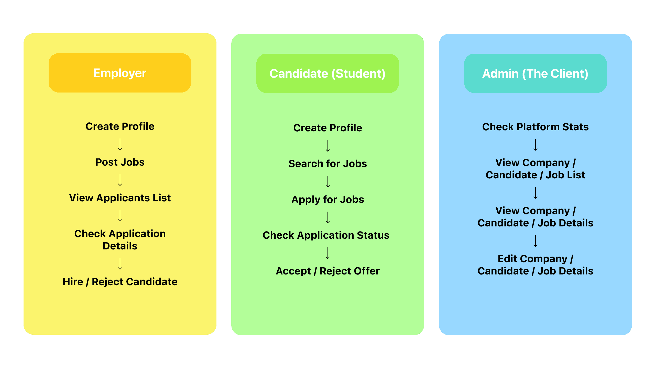
To start this project, the first thing to do was to define the target users and their needs:
Who Are The Users? | What Are Their Needs? |
|---|---|
Students from Hong Kong and GBA universities | - Search and apply for jobs |
Employer | - Need efficient ways to post jobs and proceed with applications |
The Client (Cyberport) | - Want to monitor and manage data in the backend |
Market Research
To quickly understand how similar job-matching platform works, I decided to analyze popular employment platforms, focusing on their key features and user interactions to gain insights:
Platform | Target Users | Key Features |
|---|---|---|
JobsDB | • Local HK job seekers | • Detailed job filters |
• Global professionals | • Professional networking | |
Jijis | • HK university students | • Campus-specific jobs |
Indeed | • General job seekers | • Job aggregation |
Ideate
Based on user research and competitive analysis of Hong Kong's job platforms, I developed the initial vision for our platform.
Drawing from market research, I proposed a three-platform solution: separate interfaces for candidates, employers, and administrators. This established model not only provides a clear, focused experience for each user group but also offers strategic advantages. The straightforward architecture makes development more efficient and creates a flexible foundation that can be adapted for future company projects. This approach ensures each user group has exactly the tools they need while maintaining a scalable, reusable system.
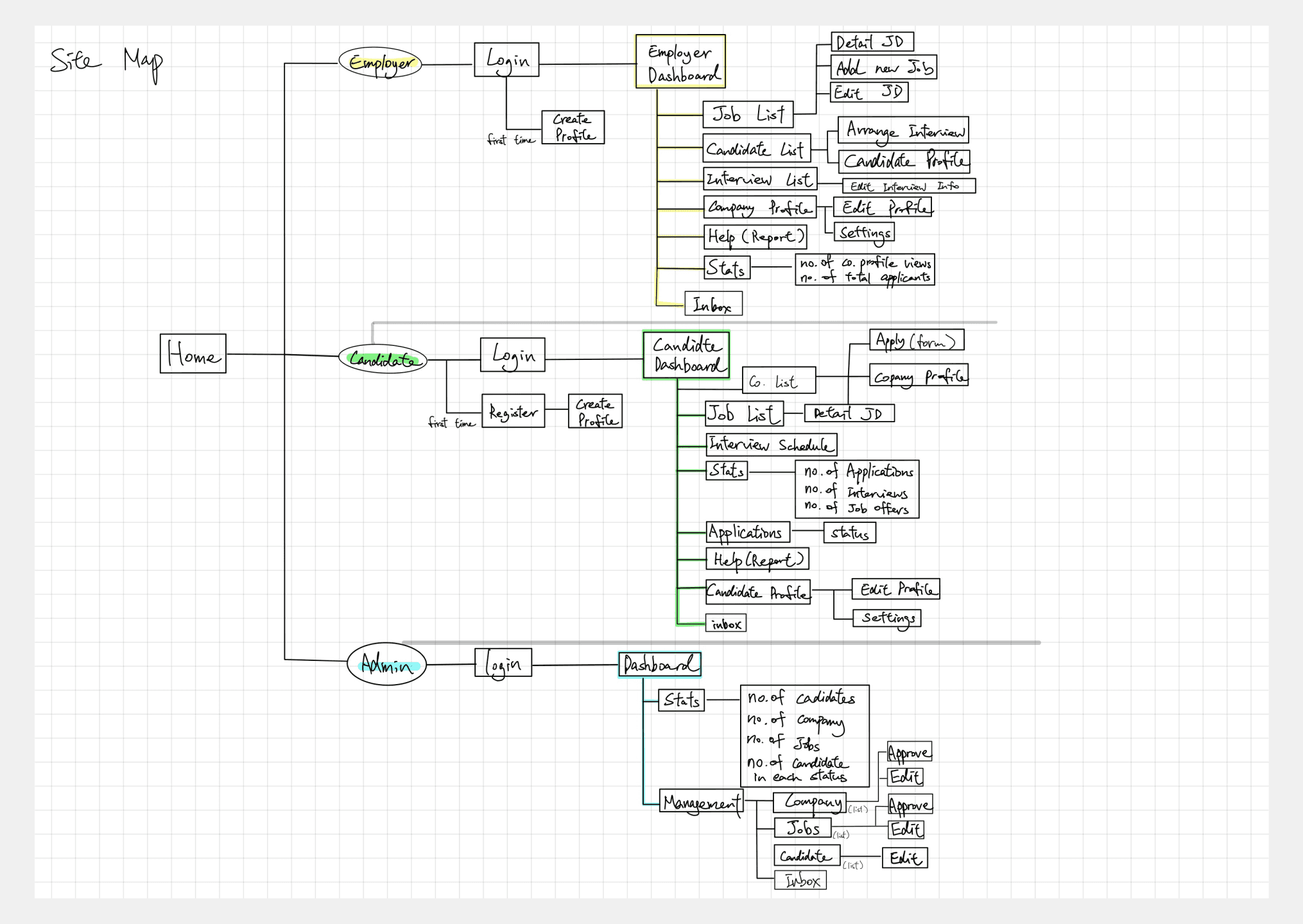
Sitemap (Initial Draft)
Low-Fidelity Wireframes
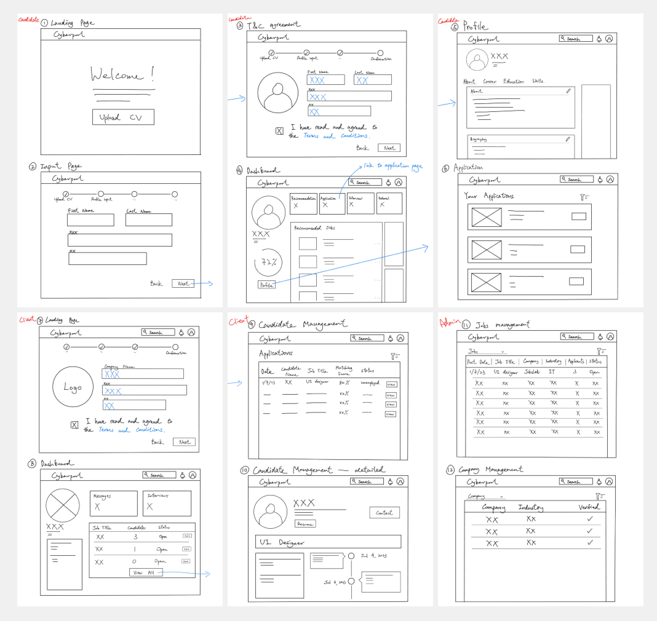
My ideation process began with hand-drawn wireframes and a basic sitemap, allowing me to quickly explore different approaches to the platform's structure and functionality. By sharing these early sketches with the client, we could validate core concepts and user flows while they were still flexible. This early alignment helped ensure we were heading in the right direction before diving into more detailed design work.
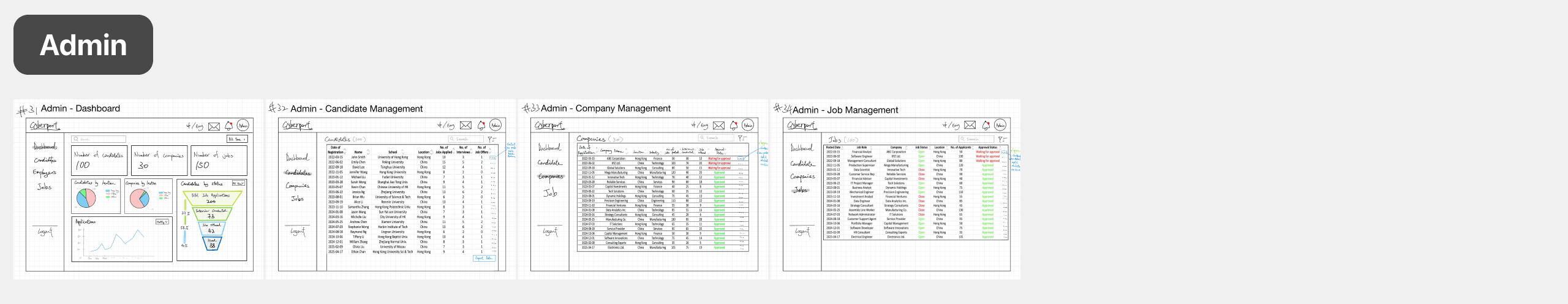
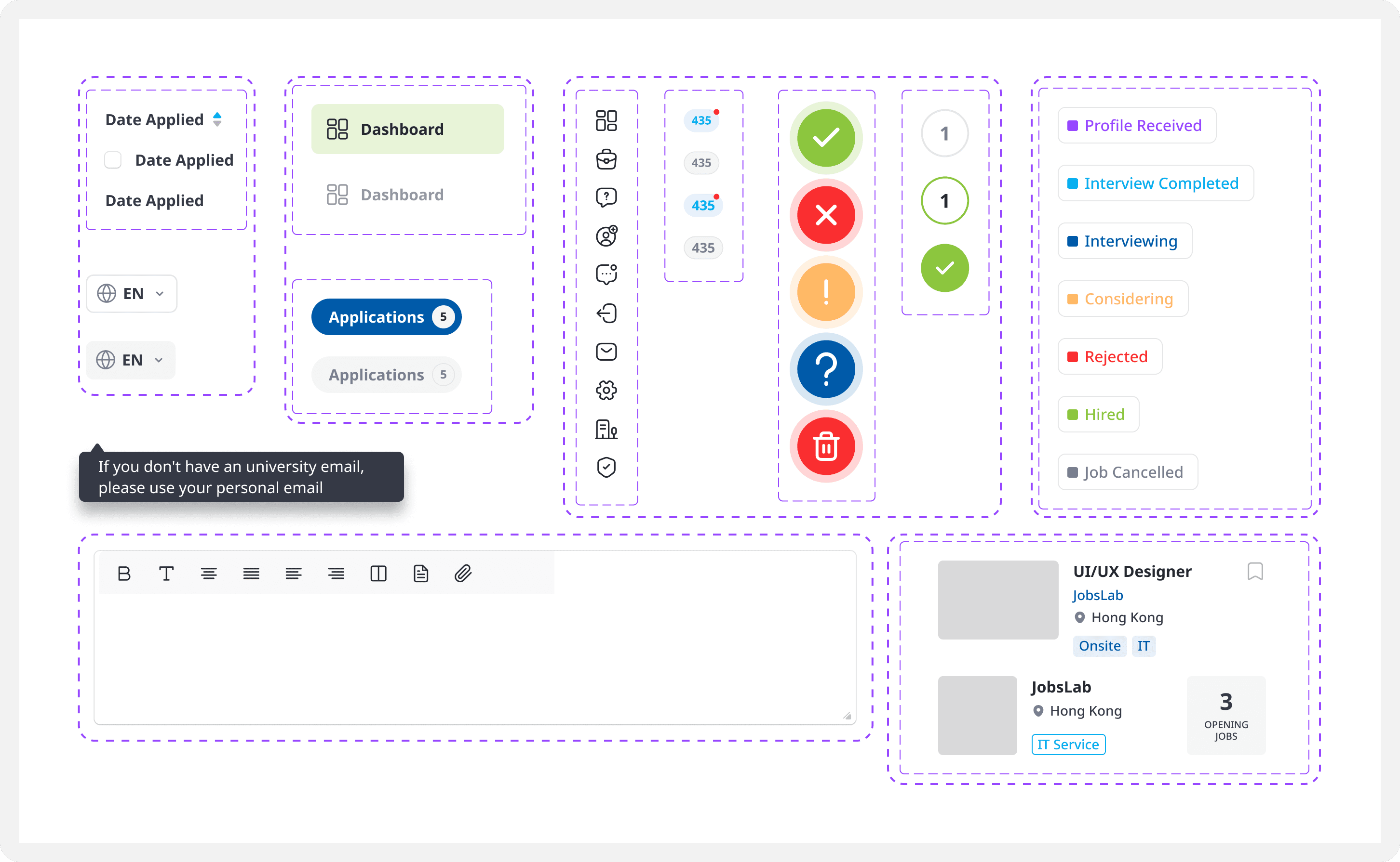
Finalized Sitemap & High-Fidelity Wireframes
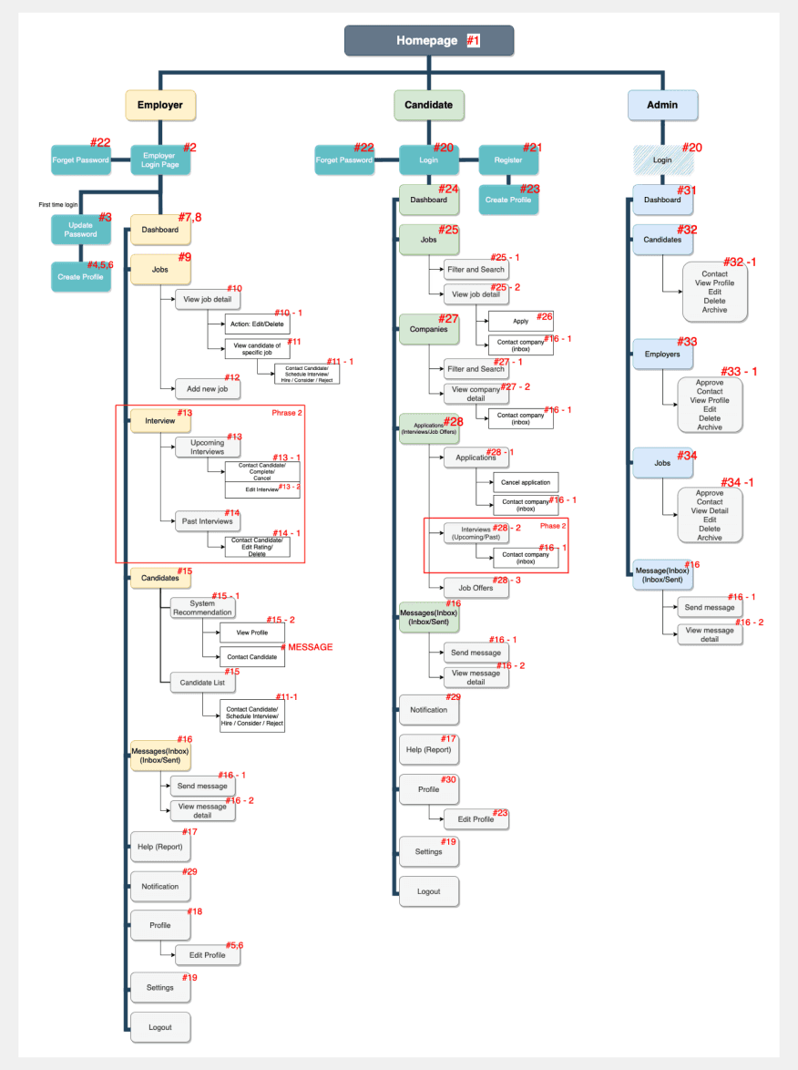
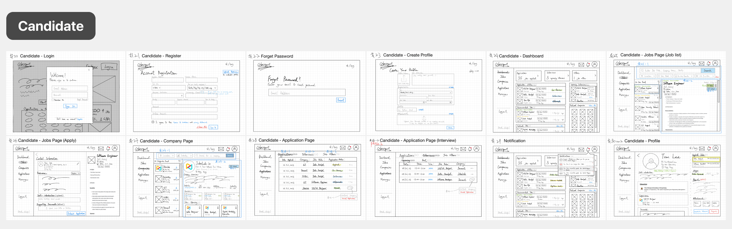
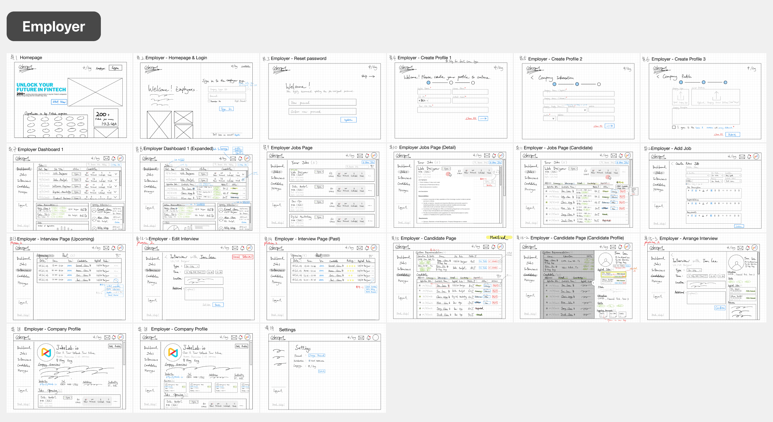
Throughout the design process, I maintained close communication with all stakeholders - the client, my supervisor, and our development team. We continuously evaluated and balanced time constraints, development costs, and feature priorities to optimize project outcomes. This collaborative approach led to strategic decisions, such as postponing the 'interview' functionality to phase two of development to prioritize core functionalities, which allowed us to meet our tight deadline and budget constraints while delivering a solid MVP. This experience taught me how to make practical trade-offs that benefit all parties - ensuring client satisfaction, managing development resources efficiently, and maintaining a quality user experience.
Prototype
Branding
The design system adheres to Cyberport's official brand guidelines and color palette, ensuring consistency with its established identity.
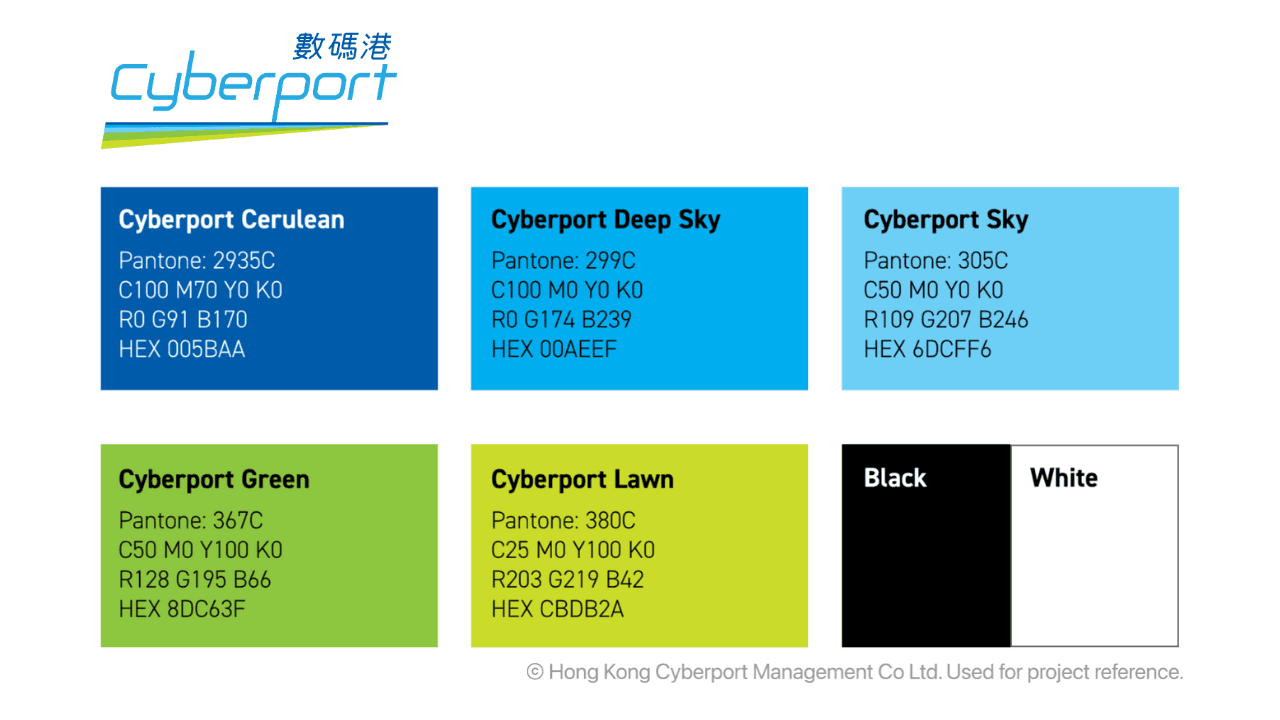
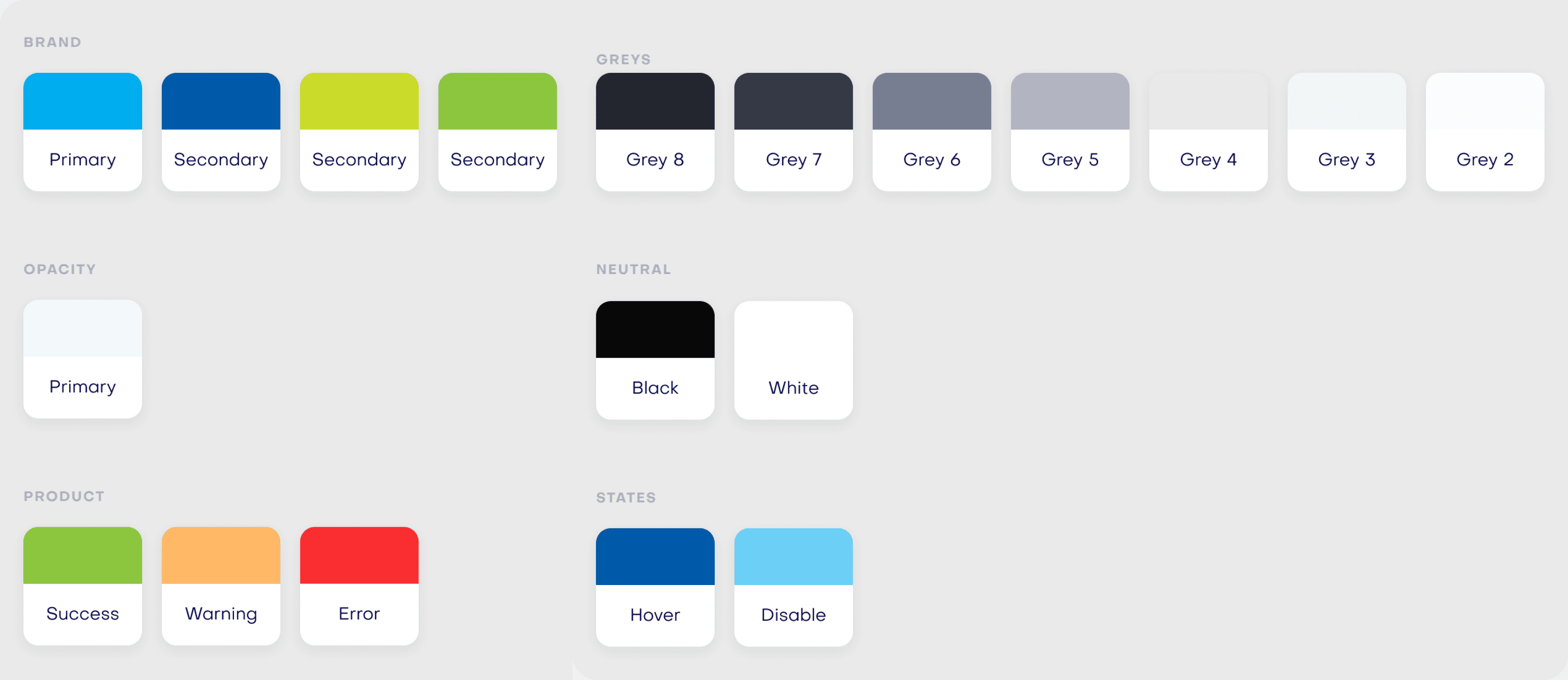
I developed a clean, minimalist UI component system that balances professional functionality and student-friendly energy. While maintaining a structured layout for clarity, I incorporated vibrant accent colors and modern, rounded elements to create an approachable feel that resonates with young users.
The design features a light color palette with strategic use of colors to indicate different application statuses. Each component was designed to be both visually cohesive and functionally distinct, making it easy for users to understand their options at a glance.
User Acceptance Testing (UAT)
After the MVP was delivered, my role shifted from designer to coordinator. The client had limited technical background and frequently requested small changes without understanding the cost involved.
To keep things manageable, we structured each review cycle around a fixed feedback window. The client was given a set period to review and provide comments, and I consolidated her requests, assessed feasibility internally, then compiled approved changes into an annotated spreadsheet for the development team in Vietnam, with screenshots and red markings to eliminate ambiguity across the language gap.
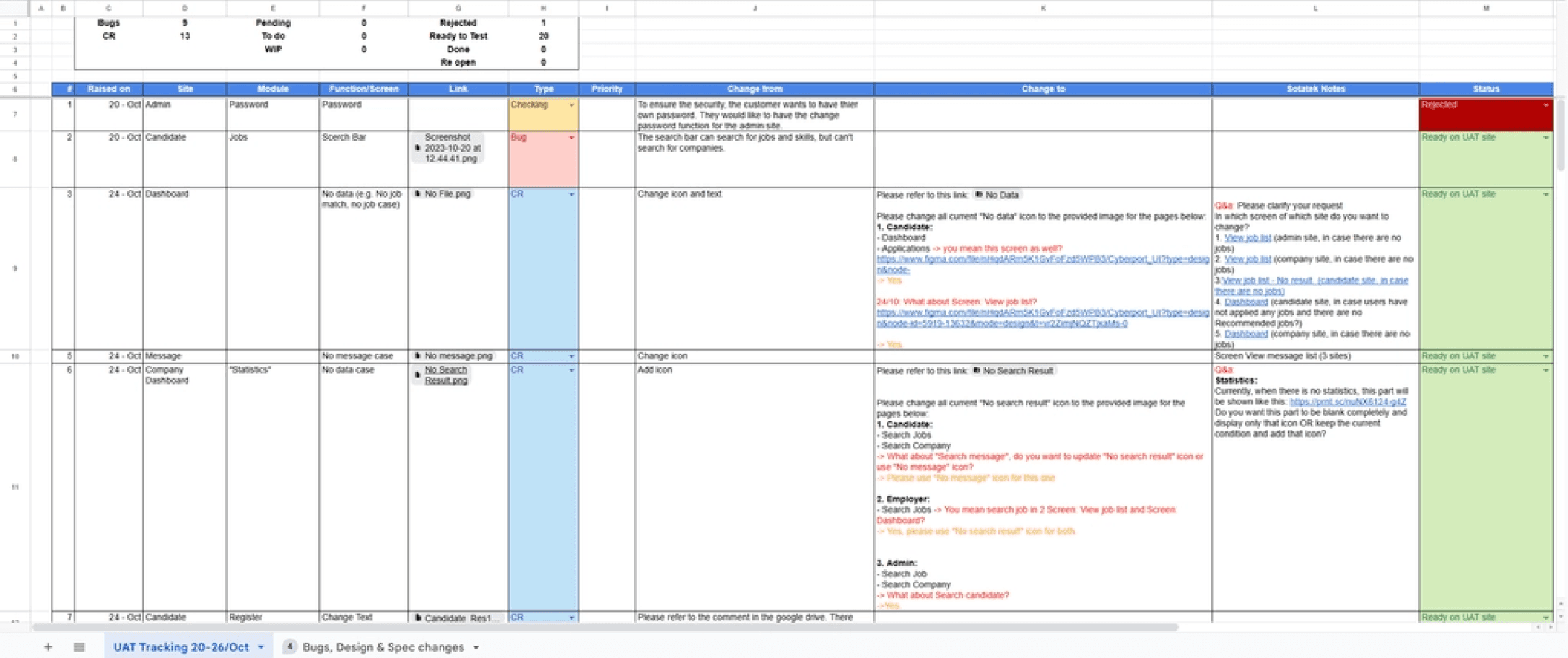
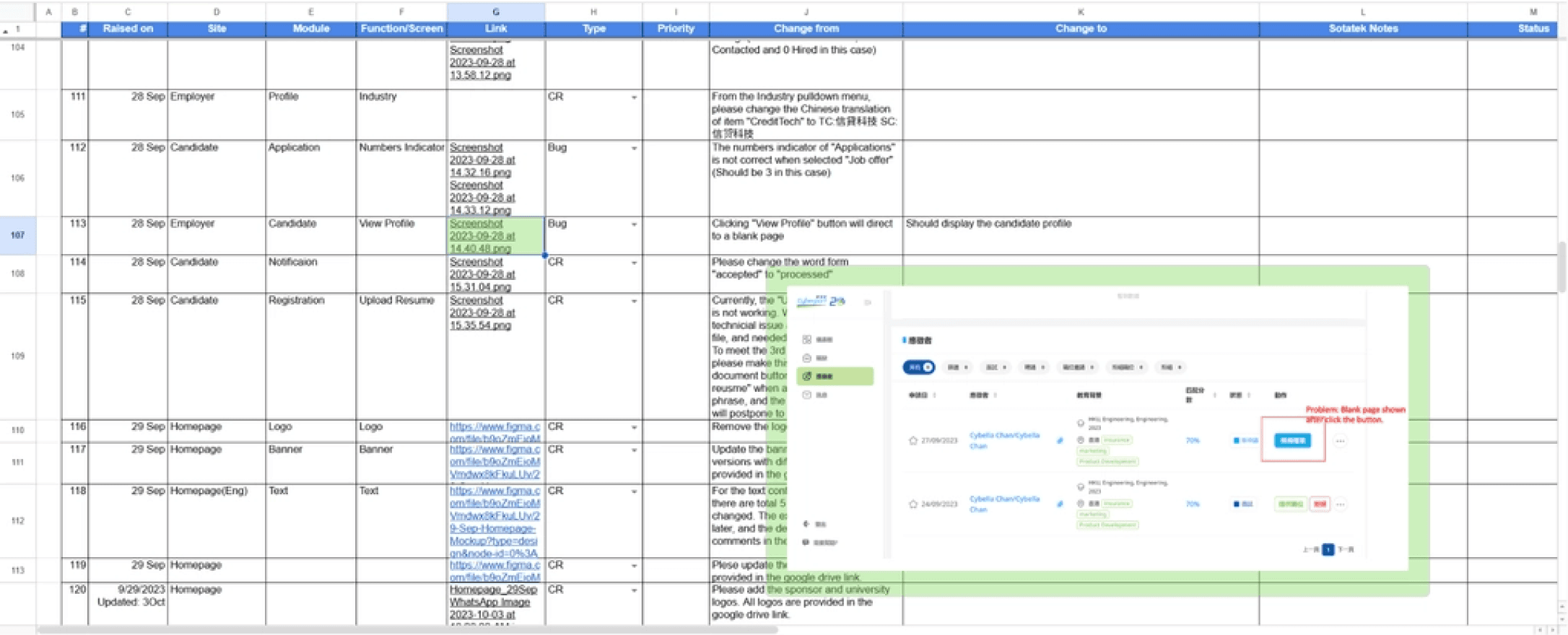
Throughout UAT, I used a real-time collaborative Google spreadsheet exclusively with our development team to track bugs, usability issues, and requested modifications.
Working as the bridge between developers and stakeholders, I managed client testing sessions while shielding them from technical complexities by translating their feedback into clear technical requirements for our development team, and adding them to our tracking system with appropriate context and priority levels. This approach allowed us to efficiently address client concerns while maintaining a professional presentation of our work process, ultimately delivering a refined platform that met the client’s expectations.
Final Result
In the months following launch, the platform demonstrated remarkable success, facilitating over 5,000 applications from more than 2,000 students across the Greater Bay Area and Hong Kong. This achievement validated our design decisions and implementation approach.
Beyond meeting Cyberport's immediate needs, the comprehensive design system in this project could serve as a solid example for JobsLab's growing project portfolio and future product developments.
Reflection
Looking back, this project taught me that delivering a product is only partly about design craft. A large part of it is communication: helping a non-technical client understand what is realistic, helping an overseas dev team understand exactly what is needed, and making judgment calls about what is worth doing and what is not. Those skills do not show up in a Figma file, but they are what kept this project on track. I came away from it understanding that being useful to a team means being someone who removes friction, not just someone who makes things look good.